


Project Type: Student Project
Deliverables: Handlettered Brand Identity Design
Programs Used: InDesign, Illustrator, Photoshop
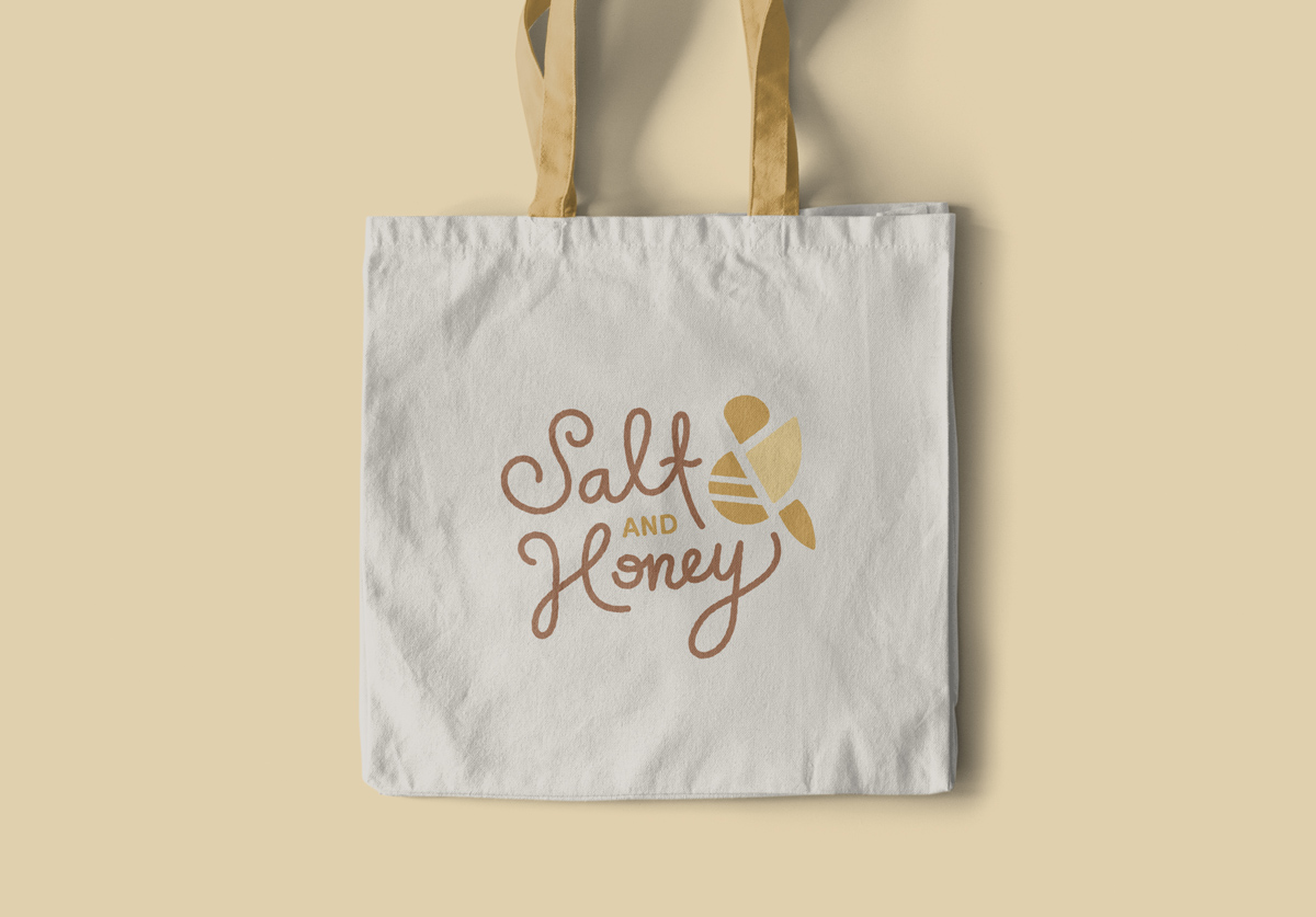
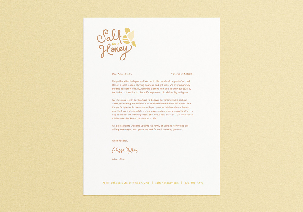
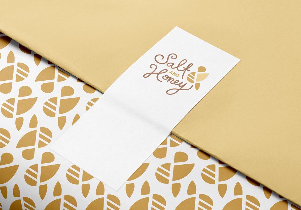
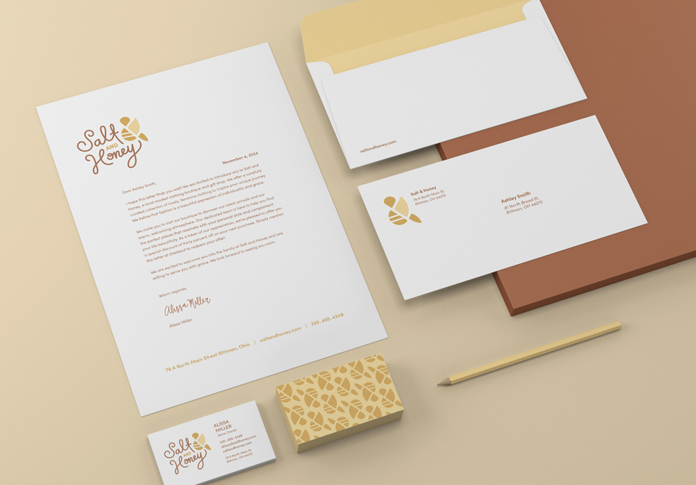
Description: I designed a new brand identity concept for Salt and Honey, a family-owned boutique known for its beautiful, feminine clothing. The logo focuses on a modern, stylized ampersand shaped like a bee—a subtle nod to the brand’s name and a symbol of peace, care, and femininity. Paired with a custom hand-lettered wordmark, the logo feels soft, friendly, and approachable.
The warm yellow-toned palette reinforces the “honey” feel, adding charm and warmth to the overall identity. The ampersand bee can stand alone or integrate seamlessly with the wordmark, making the system both versatile and cohesive. This project reflects the boutique’s values: thoughtful, welcoming, and beautifully modest.